The Client
Психотерапия и привязанность [Psychotherapy and Attachment Theory] is a pioneering platform dedicated to enhancing emotional intelligence and fostering secure relationships between the therapists and their clients. By leveraging cutting-edge research and innovative tools, the platform empowers professionals to understand and improve their interpersonal dynamics. The platform offers a wealth of resources, including personalized assessments, interactive workshops, and expert consultations, all aimed at promoting healthier, more fulfilling connections. With a commitment to evidence-based practices, it is transforming the way therapists approach relationships with their clients, making it a valuable tool for those seeking to improve their work practices.
The Challenge
Психотерапия и привязанность approached me with a vision to transform their brand, aiming to create a more user-centric design that resonates on an emotional level. They sought a comprehensive redesign that would enhance the visual appeal and effectiveness of their resources, making them more engaging and accessible to their audience. The project involved reimagining their logo, refining their visual communication style, and crafting emotive visuals that reflect the depth of their commitment to improving interpersonal dynamics.
The Logo
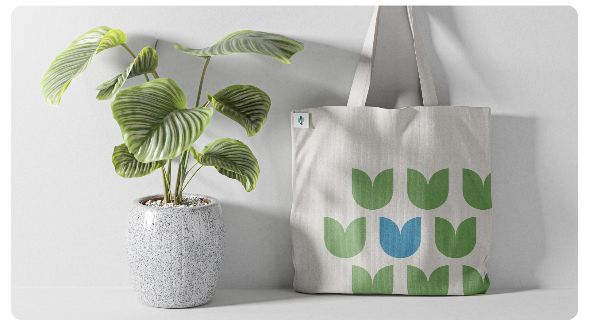
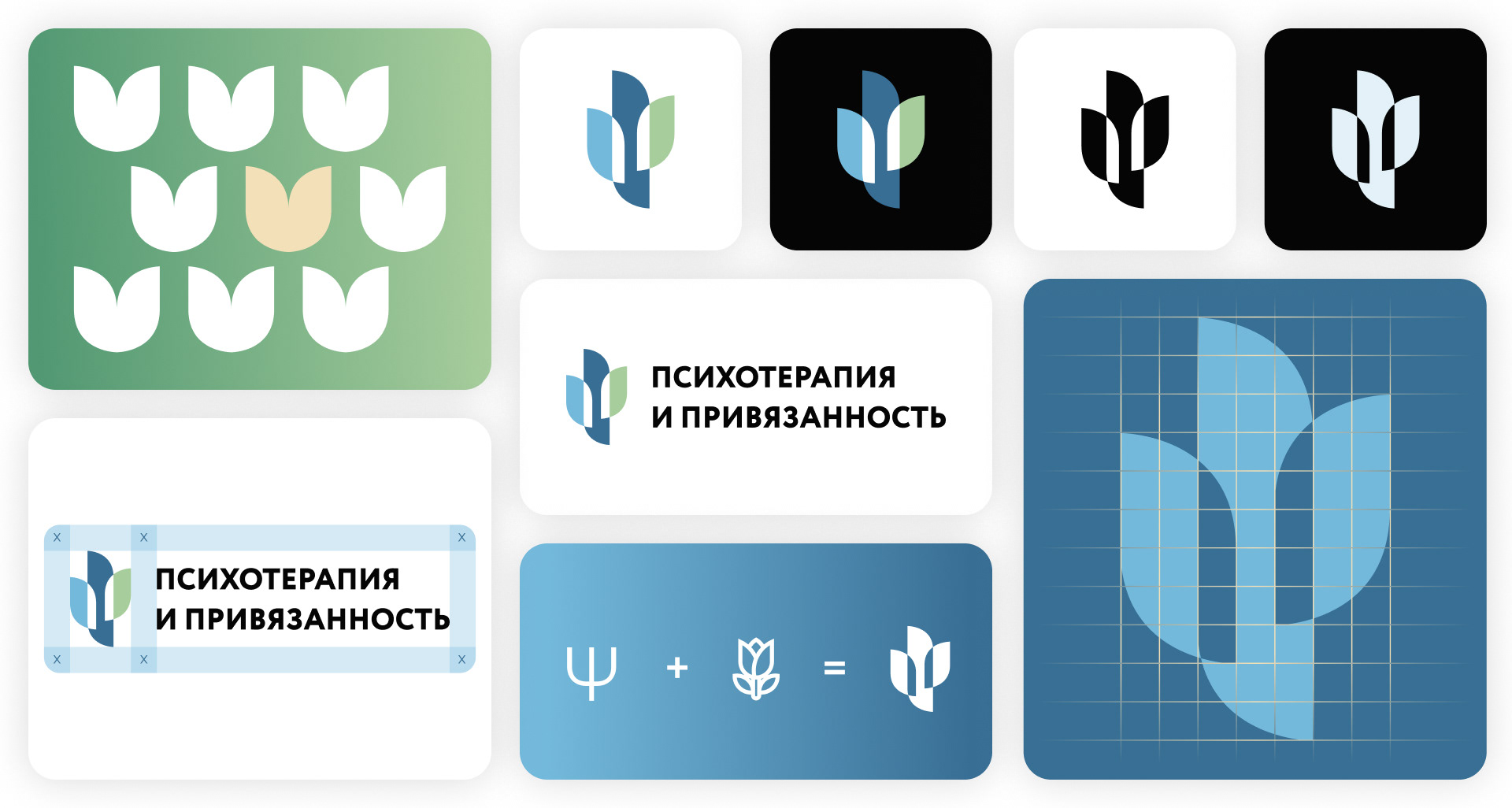
The foundation of the logo lies in its symbolic design, crafted to encapsulate the core principles of the platform. The icon integrates three petal-like shapes, representing growth, emotional connection, and professional support. Inspired by the tulip and the psychological Psi symbol, the logo evokes balance and harmony in interpersonal relationships. Its form communicates a blend of warmth and professionalism, aligning with the platform’s focus on secure attachments and evidence-based approaches.
The greatest challenge was distilling the platform’s intricate mission into a minimalist yet impactful design, ensuring it resonates emotionally while remaining clear and versatile across various mediums.
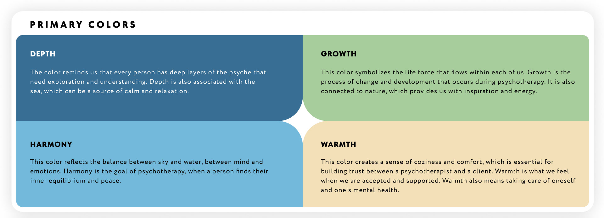
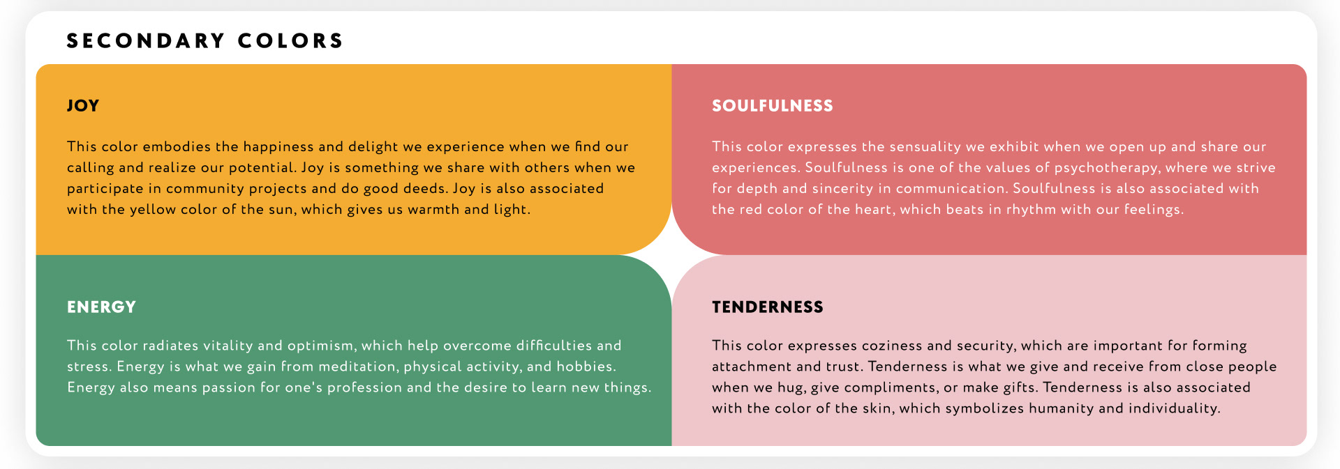
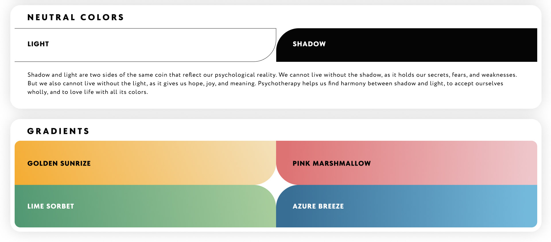
The Colors
The brand’s color palette is designed with functionality and versatility in mind, ensuring cohesive and effective visual communication. Neutral colors are reserved for typography and backgrounds, maintaining clarity and legibility across all materials. Primary colors are prominently used in key design elements, such as icons, illustrations, and UI components, providing consistency and reinforcing brand identity. Secondary colors, including warm and vibrant hues, add accents and highlights, drawing attention to call-to-action elements and creating a dynamic experience. Gradients are employed in backgrounds and transitional spaces, enhancing the sense of flow and emotional resonance in both digital and print media. This carefully structured approach to color usage ensures a harmonious balance between aesthetics and functionality, making the brand’s visuals engaging and approachable.
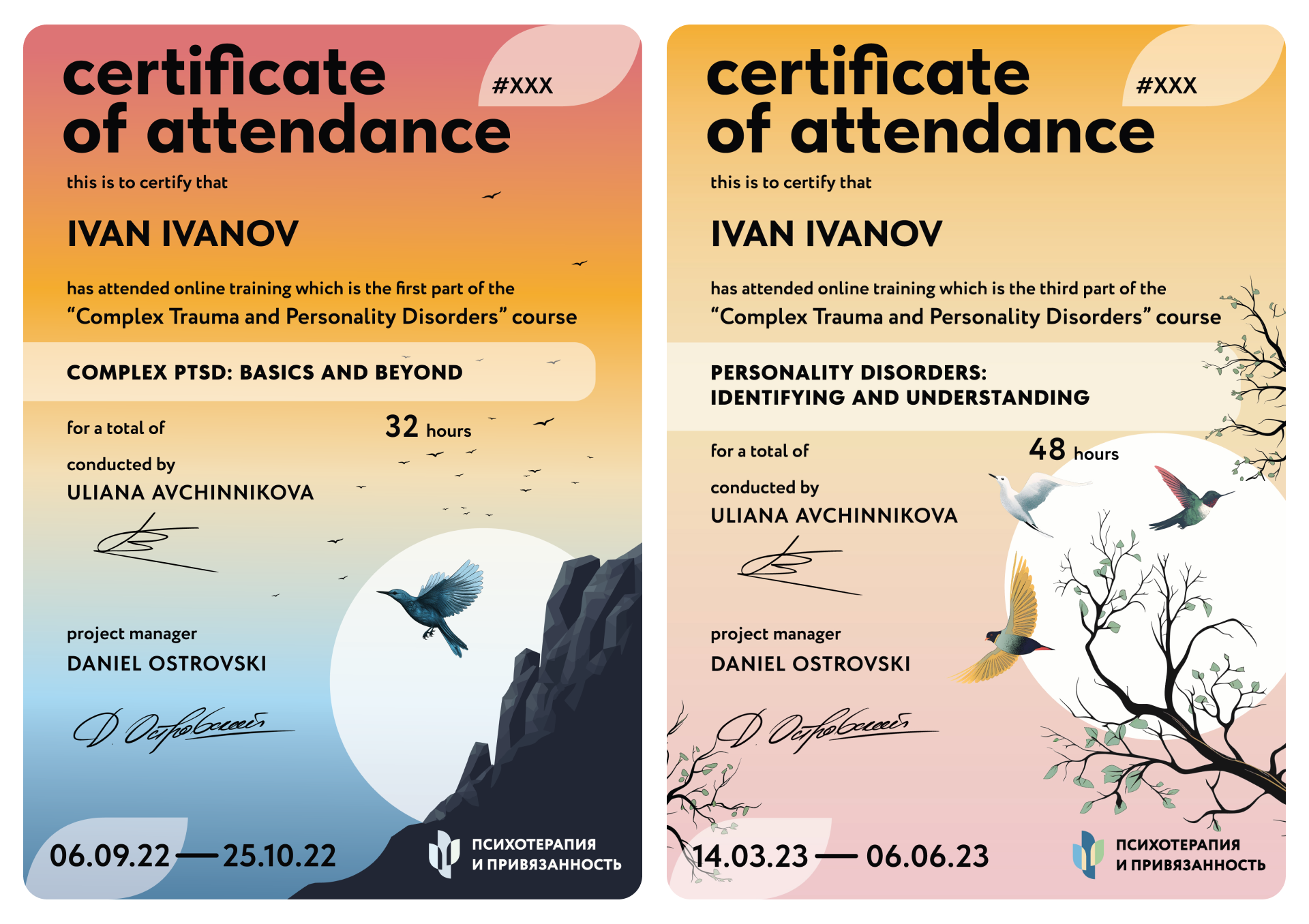
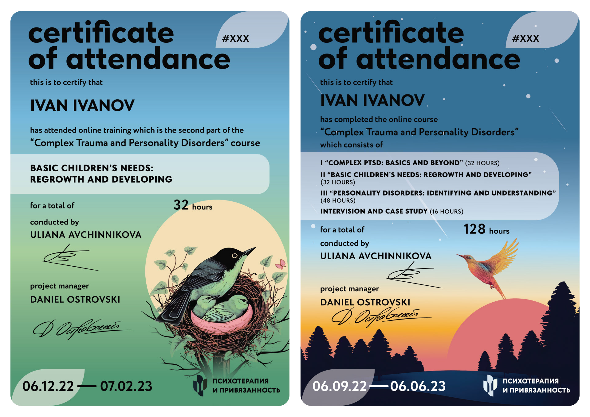
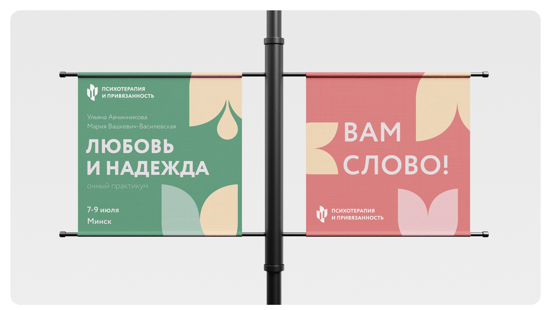
The Certificates
A pivotal element of the project, the certificates were meticulously designed to highlight the significance of the client’s training programs and convey their core values. Each certificate features bespoke illustrations rich in symbolism, thoughtfully crafted to align with the themes and objectives of the respective training sessions. The imagery integrates meaningful elements that resonate with the topics, fostering a deeper connection between the recipient and the training experience.